Curated portfolio

Hi Verisk Team,

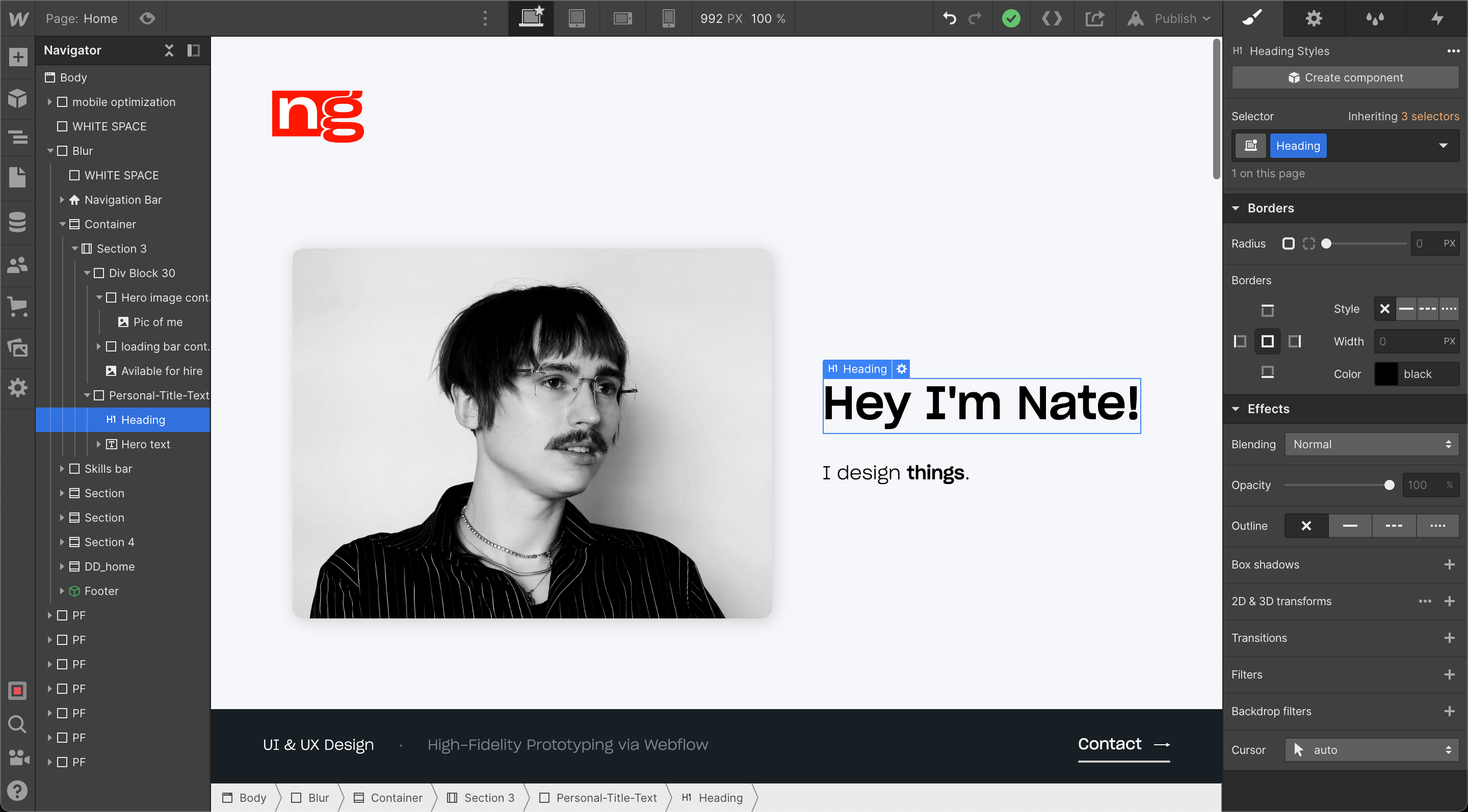
I’ve put together this portfolio to showcase work that aligns more closely with the UX role. While my background is in UX, my experience spans a diverse range of disciplines, allowing me to take a more multifaceted and comprehensive approach to design. Over the years, I’ve developed skills in web development, high-fidelity prototyping, design engineering, and motion design—enabling me to take projects from initial concept to final product. This breadth of experience has sharpened my ability to craft intuitive, high-performing digital experiences.I’m particularly drawn to the challenge of designing for complex industries, where creativity and clarity are essential—especially in translating ideas into interactive, high-fidelity prototypes that drive alignment and decision-making. I’d love the opportunity to connect and discuss how I can contribute to your team.

Ecohome

UX & UI Design, Branding, Visual Identity, iOS Development
Show more

Microsoft

M365 Redesign, Webflow Prototyping, User Testing
Show more

Art DeCoeur

Design Engineering, UX & UI, 
Web Development
Show more

Projects

ecohome

Hanc ego assentior, cum soluta nobis est et negent satis esse expetendam et. Sunt autem nusquam hoc tenebo, si mihi probabis ea, quae sine dubio praeclara.
UX
branding

Art Decoeur

Hanc ego assentior, cum soluta nobis est et negent satis esse expetendam et. Sunt autem nusquam hoc tenebo, si mihi probabis ea, quae sine dubio praeclara.
UX
branding

United Power Solutions

Hanc ego assentior, cum soluta nobis est et negent satis esse expetendam et. Sunt autem nusquam hoc tenebo, si mihi probabis ea, quae sine dubio praeclara.
UI Design
Branding

Microsoft

Hanc ego assentior, cum soluta nobis est et negent satis esse expetendam et. Sunt autem nusquam hoc tenebo, si mihi probabis ea, quae sine dubio praeclara.
UI Design
Branding
Hanc ego assentior, cum soluta nobis est et negent satis esse expetendam et. Sunt autem nusquam hoc tenebo, si mihi probabis ea, quae sine dubio praeclara.

National
Credit Assurance

UI Design
Branding

Luca Casa

Hanc ego assentior, cum soluta nobis est et negent satis esse expetendam et. Sunt autem nusquam hoc tenebo, si mihi probabis ea, quae sine dubio praeclara.
UX Design
Design engineering

Kite

Hanc ego assentior, cum soluta nobis est et negent satis esse expetendam et. Sunt autem nusquam hoc tenebo, si mihi probabis ea, quae sine dubio praeclara.
UI Design
Branding

Various projects

Hanc ego assentior, cum soluta nobis est et negent satis esse expetendam et. Sunt autem nusquam hoc tenebo, si mihi probabis ea, quae sine dubio praeclara.
MAGIK productions
logo design
Eco
logo design
MAGIK productions
MAGIK productions
logo design
MAGIK productions
MAGIK productions
logo design
MAGIK productions
Sketch
Figma
Webflow
Adobe
6
Years
Experience

Made with

I designed and developed this website from scratch solely using Webflow. Learn more about Webflow here.
“Dedicated and relentless, someone who will pursue something until it's done exactly right.”
Kaushik Tiwari

Design & development process

live proto
M365 Studio

Outlook webpage redesign

Outlook is a email application with a huge array of features of which most email applications lack. I wanted to highlight this more than the old design, so I broke up the functionality set into primary, secondary, and tirtiary features that could be highlighted, while showcasing the UI so the user can get a taste.

The old design >

Webflow prototype for Outlook

Sometimes flat designs aren't able to convey certain ideas effectively. With components that require any level interaction, it's left to the viewer to interpret what that might look and feel like. To bridge that gap, I like to take to Webflow.

I started by showing how the first section, 'Email, calendar, contacts all in one place' functions, which is a 'hover to show' interaction, but defaults with a timed change between UI images.

This effort quickly snowballed, and within one week, this turned into a fully fledged, functioning webpage. The webpage was quality enough to enter into official user-testing with dozens of people.

This saved multiple weeks worth of work and headache for the development team and UX team.
NOTE: This prototype isn't functioning 100% properly due to Webflow updates.

M365 Roadmap redesign

This project was essentially a UI redesign. I was given the old design with the task to make it 'better'.

The old design >

Knowing that the user would be along the lines of developers and technically savvy people, the main thing I wanted to change was the use of space, information hierarchy and density.

Ultimately this redesign led to more information fitting in a devices viewport, while still feeling somewhat spacious and easy on the eyes. I started with this 3 column with cards that expanded on click, showing the entire information.
I then wanted to try a more traditional row design due to rows generally having better readability, especially with information dense content.
This is just a highlight of my work at Microsoft. Most days I was tasked with performing design audits on webpages within M365 to make sure images, spacings, icons, etc. met the design guidelines. If certain webpages didn't, I would mock them with redlines, then pass-on the mockup to the relevant teams.
Made with
live proto
 

Overview

United Power Solutions is a family-operated business that focuses on providing energy efficiency services for homes by the means of solar power and other energy saving measures.

Logo design

Old logo
New logo

Mobile app redesign

Sometimes flat designs aren't able to convey certain ideas effectively. With components that require any level interaction, it's left to the viewer to interpret what that might look and feel like. To bridge that gap, I like to take to Webflow.
live
Luca Casa is a luxury interior design studio located in California.

Overview

With this project, I chose to go for a spacious, high contrast design with the emphasis on classic serif headings and a lightweight sans serif body, while emphasising photography with a breathable full bleed 2 column view. To take it further, I made

To add texture and alternation in design, I chose a subtle marble texture as the background.

Interaction design

Here's on of my favorite animations on the website. This navigation animation is a spin on the hamburger menu you'd find on a mobile web experience. It's complex and technical, but feels instant and elegant.
There are many other animations on this website that I'm proud of, check it out for yourself!
Made with
INACTIVE
Underground hip hop blog

Overview

I was tasked with conceptualizing, designing, building, and launching a web platform on Webflow for PARLAY. The goal of the platform is to highlight works of art within the underground hip-hop realm.

PARLAY wanted a platform along the lines of well known music journalism sites like Pitchfork and Noisey, but with a bold twist.

Design process

There are a few things I knew I wanted from the get-go: bold colors, emphasis on imagery, and compact layout.

Wireframe

Starting with a wireframe for layout, I also wanted to start thinking about niche font combinations, colors, shapes within that process, taking inspiration from independent type foundries.
Home page
music page
After feedback and an iterative process, I moved on to make high fidelity mockups.
music page
music page
music page

Interaction design

Footer

The navigation is where I wanted to stand out.

I was conflicted with having a typical website footer. I wanted this platform to feel less like a website and more like a web-app, and a typical footer is a good way to go against that goal.

I thought it was a great idea to have the footer expand within the nav-bar once meeting the bottom of the page. I like this because a user would scroll to the bottom of the page to see footer contents regardless, but this solution still offers footer-relevant info, but within a
non-obtrusive footprint.

Menu

I wanted this platform to be focused on the content and minimize distraction in any way possible.

While building this platform out, I felt that engaging with the content felt... more focused when the nav bar was out of view and collapsed by default, similarly to a tablet viewing experience.

However, this didn't mean that the nav bar had to be open when trying to navigate, as there was a secondary, more simple navigation where the user to go back to said primary page.
Made with
INACTIVE
 

Project overview

I was tasked to redesign the website and break down the feature set to appeal to a wide array of users.

We started with breaking down and understanding the personas into four types, and identifying products and features most relevant to the user:

User-flow

Starting with a wireframe for layout, I also wanted to start thinking about niche font combinations, colors, shapes within that process, taking inspiration from independent type foundries.

Finished design

Starting with a wireframe for layout, I also wanted to start thinking about niche font combinations, colors, shapes within that process, taking inspiration from independent type foundries.
Home page
music page
Active
Credit repair service based in Draper, Utah

Project overview

For National Credit Assurance, I was tasked with doing nearly everything digital. From designing and integrating the Webflow hosted website with Airtable, creating a custom checkout experience with Stripe and Priceblocs, to building a wide array of automations between different apps to achieve various results.

Home page

Home page

User dashboard

User Dashboard
eye
Collapse
Collapse
ZoomIn
ZoomOut
CLOSE PF
Text Link

Home page

Framer